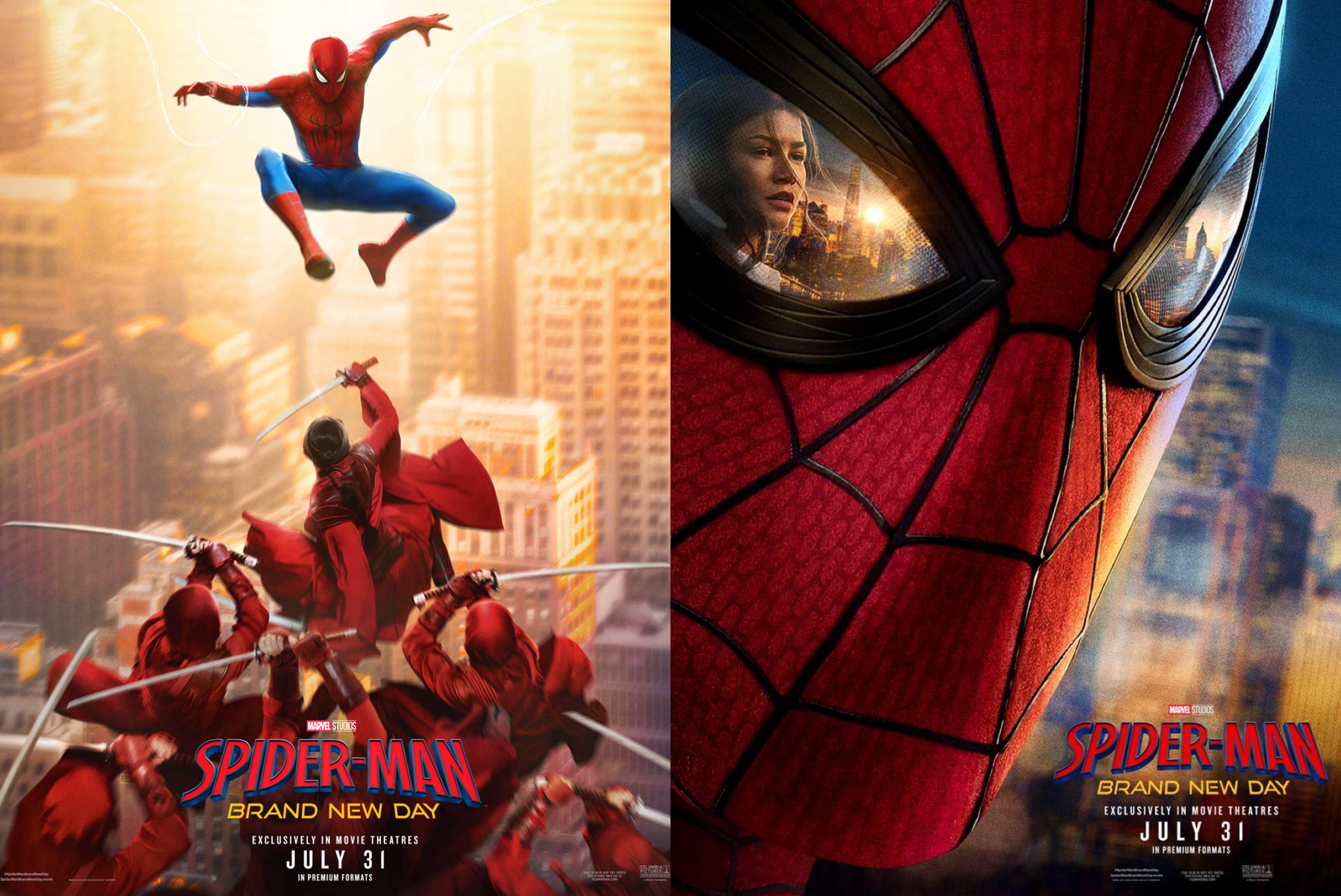
That second one is a worse version of the Spider-Man 2 poster with Doc Ock reflected in his lens
brandonsamd6 on
Beautiful
JannTosh70 on
The Holland movies have pretty bad posters and it continues here
rutujz on
they look so bad. poorly made
chynkeyez on
Why does Zendaya kinda look like Kirsten Dunst in that reflection. Is this a weird trick my brain is playing? Am I alone?
Luigiperps on
The first one is kinda giving Scott Johnson vibes
ReaddittiddeR on
Wondering which characters that will be added to that Spider-Man vs The Hand slo-mo shot.
hantsu2018 on
the right one looks like Sam Raimi’s
Haunting-WaferWah on
Zendaya really is having quite the year
AkiraKitsune on
wow these are terrible. my god.
ShakeZula30or40 on
Makes it look animated
Chessh2036 on
That poster on the right is giving off 2000’s Spider-Man vibes. They always had the villain or MJ reflecting in his eyes on the poster.
CombatPanoo on
AI
Bariumdiawesomenite on
Why does Sony keep hiring the shittiest poster designers for the job? It’s not funny for the fourth time!
sharkbait2006 on
Love the Spider Man 2 homage
FancyShrimp on
SPIDAH-MAN 2 WE BACK
theplasmasnake on
The imagery between the trailer and the posters has been top tier. God, I hope they don’t screw this up. We need a good street level Spider-Man story so bad.
EricRShelton on
I hate that they finally “Peter Parkerized” him at the end of No Way Home, but the idea of him fighting The Hand? Yeah… I’ll probably relent and see it.
doeraymefa on
I thought we were over the Zendaya arc. Kinda sad they kept her and Ned’s actor around. Was hoping for something new. Brand New. Today.
theastro_not on
Why do the recent Spider-Man movies always get the worst posters. Please Disney I know you can afford to hire better designers.
That said I do kind of like the one on the right
shogun77777777 on
Bring on the slop!
EvieIsSilly on
It’s so peak 🥹
Top_Report_4895 on
Spidey vs Ninjas, I’m in
Chinchillin09 on
“We have Raimi’s Spider-Man 2 poster at home:”
igetproteinfartsHELP on
THEY’RE COOKING
ManufacturerBest2758 on
Seem weird to anybody else that Tom Holland and Zendaya both turn 30 this year and are still playing teenagers?
Laniger on
Ok that poster with the red hand is fire!
PandaClaus94 on
Idc about the hate for the Hand and all their older portrayals of them, but if they bring back at least an homage to that dude with the animal tattoos that could fuckin’ summon them like a goddamned Druid from Diablo 2, I’m all the way in.
Not like I wasn’t beforehand, but ya
DC_deep_state on
I do like that the MCU gets a little weird with their storytelling.
I didn’t imagine spidey fighting ninjas after NWH lol
BRLY on
Ned should be in his right eye.
dmisfit21 on
You had me at Spider-Man vs ninjas!
MajesticKiros on
These posters are giving me a nostalgia vibe to the Sam raimi trilogy.
Blade_Shot24 on
The Hand?!
Bulbasaur2015 on
yay
2dal3atcave on
This movie is starting to feel very Sony-fied
Pulp-Fiction-576348 on
Second one giving Spider Man 2 vibes
Huseynov26 on
Holy shit the poster on the right is straight off Raimi.
Practical-Cut-7301 on
Why that right one look like a hard mask and not a fabric one
ostovca on
The right looks cool but its definitely giving some AI art vibes… wayyy too HD looking, whereas Spider-Man 2 had covers that used a lot of lighting for the visuals to pop.
The background of the buildings also looks completely different from Spider-Man’s lenses.
PirateKernel on
is it coming to PC or it’s a PS5 exclusive?
UnknownChaser on
I can’t believe they edited out the towers out his reflection
Lazymanproductions on
They could finally get a real MJ instead of zendeya, but nope. Here comes the ‘true love prevails past boarders and all logic’ story line that will no doubt complete waste the gravity of Peter’s sacrifice and his burden as Spider-Man.
Poopoodemons on
they can’t make zendaya pretty even with painterly style
SafetyRight8344 on
these posters look sick! love the action vibe and the color pop, can’t wait for the release!

46 Comments
Fire
Somehow the Hand returned
That second one is a worse version of the Spider-Man 2 poster with Doc Ock reflected in his lens
Beautiful
The Holland movies have pretty bad posters and it continues here
they look so bad. poorly made
Why does Zendaya kinda look like Kirsten Dunst in that reflection. Is this a weird trick my brain is playing? Am I alone?
The first one is kinda giving Scott Johnson vibes
Wondering which characters that will be added to that Spider-Man vs The Hand slo-mo shot.
the right one looks like Sam Raimi’s
Zendaya really is having quite the year
wow these are terrible. my god.
Makes it look animated
That poster on the right is giving off 2000’s Spider-Man vibes. They always had the villain or MJ reflecting in his eyes on the poster.
AI
Why does Sony keep hiring the shittiest poster designers for the job? It’s not funny for the fourth time!
Love the Spider Man 2 homage
SPIDAH-MAN 2 WE BACK
The imagery between the trailer and the posters has been top tier. God, I hope they don’t screw this up. We need a good street level Spider-Man story so bad.
I hate that they finally “Peter Parkerized” him at the end of No Way Home, but the idea of him fighting The Hand? Yeah… I’ll probably relent and see it.
I thought we were over the Zendaya arc. Kinda sad they kept her and Ned’s actor around. Was hoping for something new. Brand New. Today.
Why do the recent Spider-Man movies always get the worst posters. Please Disney I know you can afford to hire better designers.
That said I do kind of like the one on the right
Bring on the slop!
It’s so peak 🥹
Spidey vs Ninjas, I’m in
“We have Raimi’s Spider-Man 2 poster at home:”
THEY’RE COOKING
Seem weird to anybody else that Tom Holland and Zendaya both turn 30 this year and are still playing teenagers?
Ok that poster with the red hand is fire!
Idc about the hate for the Hand and all their older portrayals of them, but if they bring back at least an homage to that dude with the animal tattoos that could fuckin’ summon them like a goddamned Druid from Diablo 2, I’m all the way in.
Not like I wasn’t beforehand, but ya
I do like that the MCU gets a little weird with their storytelling.
I didn’t imagine spidey fighting ninjas after NWH lol
Ned should be in his right eye.
You had me at Spider-Man vs ninjas!
These posters are giving me a nostalgia vibe to the Sam raimi trilogy.
The Hand?!
yay
This movie is starting to feel very Sony-fied
Second one giving Spider Man 2 vibes
Holy shit the poster on the right is straight off Raimi.
Why that right one look like a hard mask and not a fabric one
The right looks cool but its definitely giving some AI art vibes… wayyy too HD looking, whereas Spider-Man 2 had covers that used a lot of lighting for the visuals to pop.
The background of the buildings also looks completely different from Spider-Man’s lenses.
is it coming to PC or it’s a PS5 exclusive?
I can’t believe they edited out the towers out his reflection
They could finally get a real MJ instead of zendeya, but nope. Here comes the ‘true love prevails past boarders and all logic’ story line that will no doubt complete waste the gravity of Peter’s sacrifice and his burden as Spider-Man.
they can’t make zendaya pretty even with painterly style
these posters look sick! love the action vibe and the color pop, can’t wait for the release!