
Back again with an update after a busy night and day of working on the site. A bunch of previous updates (read about the more recent here), but today's update id a good one!
What's new:
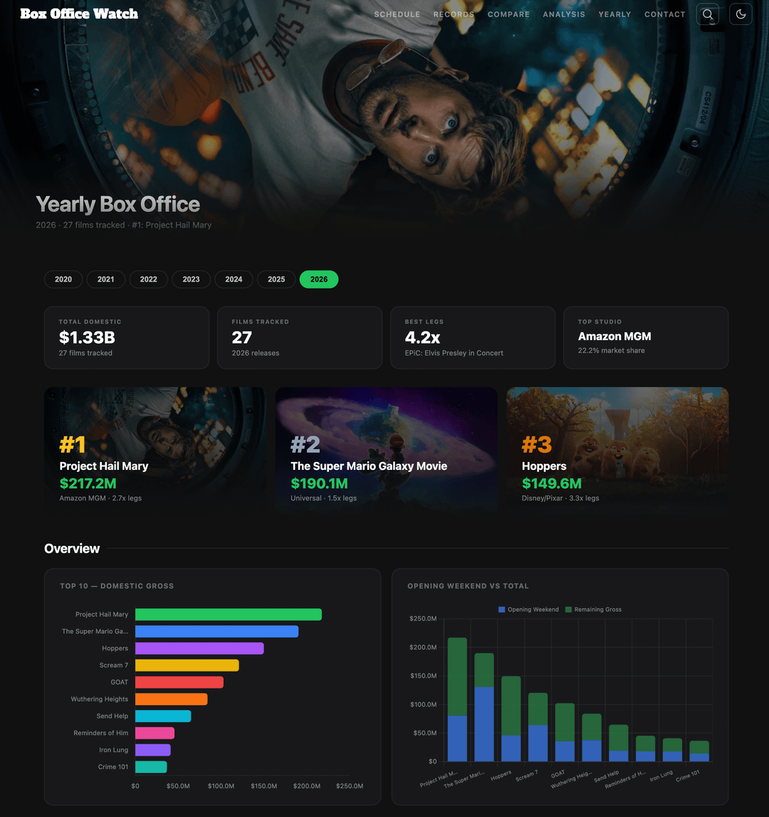
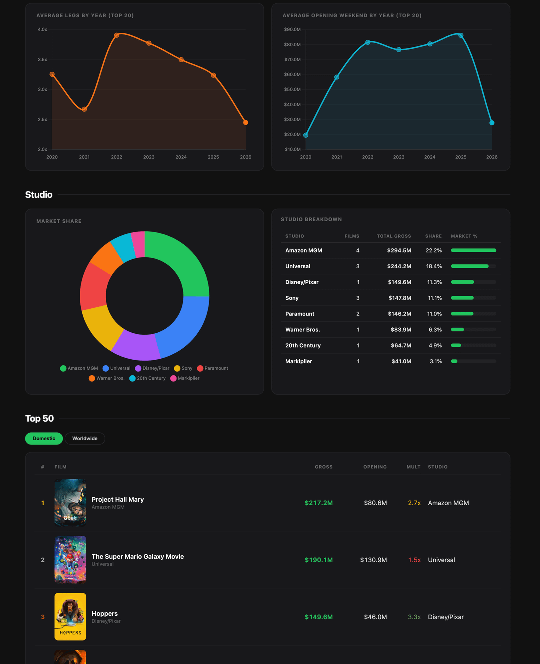
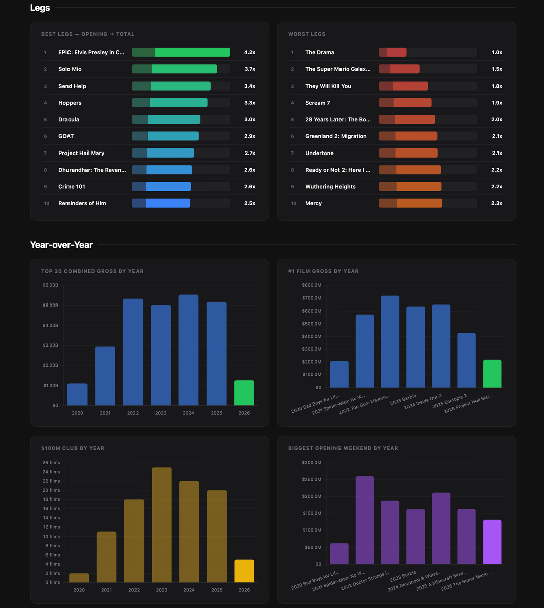
– A new yearly tab!
Lots of people asked for this. I included in the form of a bunch of different tables and graphs. These are all things I personally found interesting on a yearly basis, but tell me what's missing or what is not useful.
Note: this will only track yearly data for the top 50 movies domestically in the past, so while I hope still useful, it will still be missing smaller entries and therefore won't give the absolute total yearly amount, although I've found top 50 pretty good for now. 2026 onwards though, it'll have much, much more as I'm keeping up with active movies daily.
– More movies pages
Find the top 50 domestic movies each year post pandemic 2020-2026.
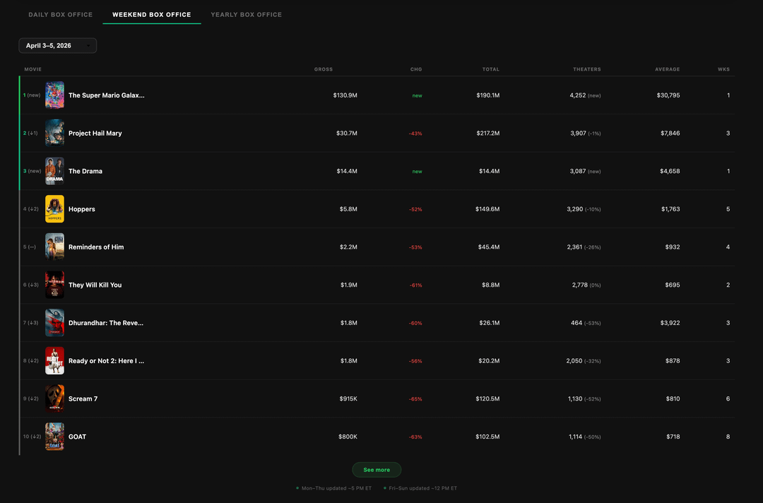
– Better daily weekend chart
An easier to read weekend/daily chart on the home page. Cleaned up the old one to make it more usable and pleasant to look at.
– A better way to read articles
Articles on the homepage now link through to the analysis pages instead of expanding. Expanding was a little awkward previously, and now that I have an analysis tab built, decided it's a better reading experience over there.
– More color in the compare page charts
Compare pages have more color in the graphs and info, making them easier to read.
– Cast and Crew
Key cast and crew now added to movie pages.
– Hitpig movie page added to roadmap as coming soon. Huge.
I'm making a running list of suggestions as you comment them, so keep them coming.
The site spiked at 3000+ views and 900+ people on Sunday, which is the biggest day yet and really cool to see. For anyone who's been enjoying it and coming back regularly for data, thanks for the support!
Check it out at boxofficewatch.com
by Leather_Tea1993
3 Comments
Rapidly becoming the best box office site on the market. Amazing work man.
This strikes me as a website made my Claude. Not criticising or suggesting it definitely is or anything but it’s just similar to a personal finance project I’ve been doing over the past months. One thing that would be a good fix is that currently when you click on a piece of information, the pop-up box always appears to the right, even if this means the information isn’t on the screen.
Fixing that would go a long way to making the site more usable imo. Love the look of it so far though!
Also the weekly decline graph i think is wrong? Showing a wk2-3 drop of 60% for PHM. There’s been a 60% drop from wk1 not wk2 so not calculating the right figure there.
People are overlooking the best part of this
https://preview.redd.it/ymxglkiy6ntg1.jpeg?width=1924&format=pjpg&auto=webp&s=5412759e8564ce0503e7a4d467251d539fa0ae07