
Now there are quite a fair few complaints about Chris Nolan's new Odessey movie, mostly directed towards the lack of historically accurate/authentic looking armours but my annoyance isn't because of that. My annoyance is towards the lack of creativity and colour in the armour from the movie, especially compared to armours from movies from the past.
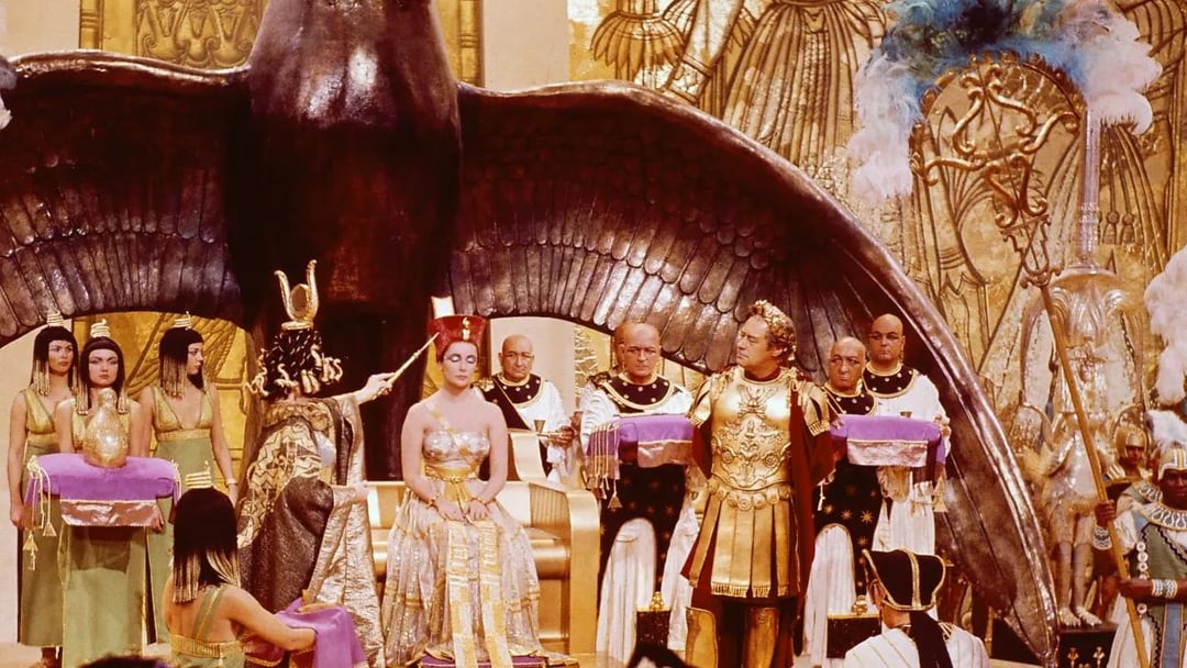
For example; the first picture is from the 1963 movie "Cleopatra" and well it speaks for itself, there is an abundance of colour and detail it not just the set but the costumes and more importantly the armour of the Roman general. Notice the gold and the intricate details on the armour.
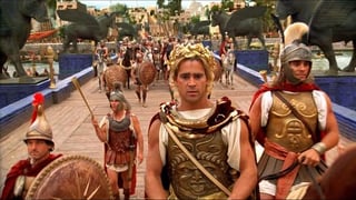
The second picture is from the 2004 movie "Alexander" which didn't get the best reviews but my god the visualisations in the movie were amazing and again notice the details in the armour and the vast colour palette.
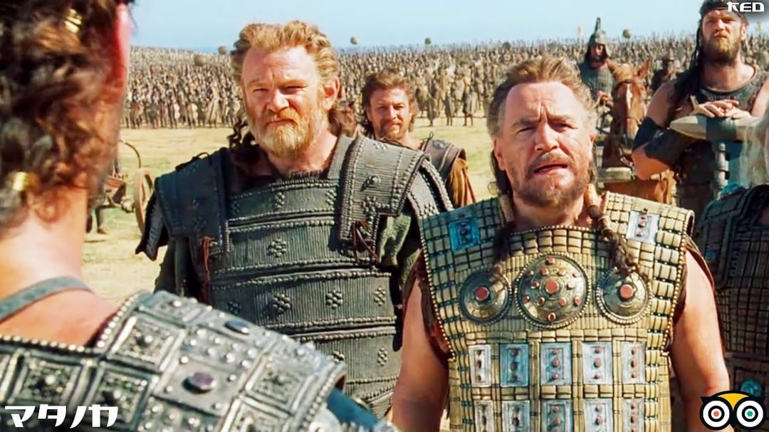
The third is from the movie "Troy" (2004 as well), now we're slowly starting to see colours fade away and bring in more neutral tones but the details in the armour and costumes stay. The coloured stones in Brian Cox's armour and stylisations of said armour, to Brendan Gleeson's armour which does lack colour, but it doesn't lack detailing. Sean Bean's costume in the background can also be seen with colourisations and Eric Bana's in the foreground has some nice details as well.
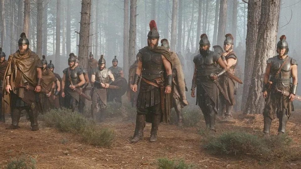
Now last and certainty least is "The Odessey" (2026) and uh yeah…. it's definitely armour alright, just not very good armour. The only colour that stands out is the subdued red crest on Matt Damon's helmet and that's about it.
Now if you want to go onto the historical standpoint of these costumes "Alexander" has the most accurate followed by "Cleopatra". Unbeknownst to a lot of people the ancient Greeks LOVED colour, you only have to look at old paintings and mosaics that have survived to see that. Why not implement that into the story telling of movies? People throughout history have loved colour and vibrancy but for some strange reason in modern times that has faded away. If you live in a city just look outside your window or walk down the street and see how much colour you'll see, I would bet you'd mostly see gray and white. Count the cars that drive past and see how many aren't a dull tone, enter a millennial's home and see if they have a wall other than white. I just want colour in my movies ffs, that's all I ask for.
by Papa_Blitzer
4 Comments
How about we let the movie come out first before we judge it
Cleopatra was in technicolor. Thats not necessarily accurate or the way it actually looked during filming. The latter movies arent technicolor, and oversaturated colors wouldnt necessarily work for the narrative and tone.
Wes Anderson used it all
I looked at the images before reading your text and assumed they were all from either Cleopatra or Odessey.
I thought that damn that actor from 1963 looks a hell of a lot like Colin Farrell…